In 2008, Barack Obama’s Chicago headquarters housed engineers from Facebook and coders from Google. Everything was optimized for the web, from the talking points to the logo—the simple, minimal, now iconic Obama “O.” The candidate’s graphic designers even made use of a new typeface, Gotham, which was so well suited to social media that the Discovery Networks and SNL later folded it into their own branding.

A decade later, the minimalist, startup-y aesthetic Obama pioneered during his first campaign is omnipresent, both in politics and in Silicon Valley, where apps from Tinder to Facebook have taken to using the style in their marketing materials. Partly because of its simplicity and adaptability across platforms, half of the 2020 Democratic field has embraced good, responsible, rather vacuous 2010s design, as well.

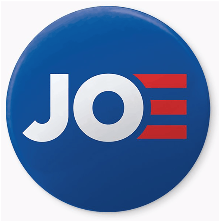
When Joe Biden, for instance, released his campaign logo in April, Twitter users compared the “E” in “Joe” to a squiggle of Aquafresh toothpaste; some quipped that the “E” was grabbing the “O” without its consent. (A number of photos showing Biden embracing women had been circulating in the press.) But these design choices have deeper meaning: Biden picked a geometric typeface almost identical to the one Hillary Clinton used during her campaign, and the three red bands in the “E” resemble a discount version of the horizon motif in the Obama “O.” It’s a logo meant to convey continuity, as though his administration really would be Barack Obama’s third term.

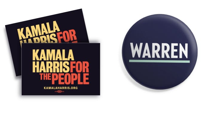
Biden has plenty of company in this respect; John Delaney’s branding goes even further in riffing on the Obama “O” (though, with two beams of light streaming out of the “D” in Delaney, it ends up looking more like an advertisement for Lasik eye surgery). But a handful of candidates are explicitly rejecting this aesthetic—going further back in the design lexicon to a past before Silicon Valley took over our cultural and aesthetic consciousness. Bernie Sanders was already mining the midcentury for visual cues in 2016. His campaign signs were, and still are, written in Jubilat, a weighty font that couldn’t be further from the sleek typefaces of Silicon Valley tech firms. Kamala Harris’s campaign logo recalls the 1972 branding from Shirley Chisholm’s campaign, which itself borrowed from the protest signs of the civil rights movement.

Amy Klobuchar’s heavy serif calls to mind the groovy aesthetic of Harold Hughes’s unsuccessful 1972 presidential campaign. And in a nod to the New Deal era, Elizabeth Warren chose a condensed deco-esque typeface and American Standard mint-green accents that pay homage to the design language of the 1930s. It’s telling that these are some of the candidates who have spoken out most sharply against Big Tech’s pernicious influence on our elections and economy.
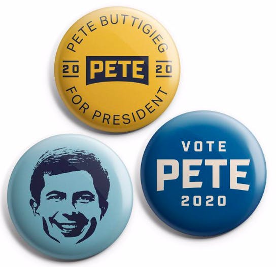
Beto O’Rourke and Pete Buttigieg are outliers in all this; their chiseled typefaces look more like blue jeans branding than presidential logos, strange simulacra that evoke some vague, undefined middle-American nostalgia.
It is perhaps not a coincidence that the candidates whose branding alludes to the past hold the top positions in the polls. In many ways, typefaces reflect shifts in public taste and opinion. When we as a culture and as consumers of design collectively tire of an aesthetic, it reflects more than just boredom with the design itself, but a restlessness with what it stands for. These are difficult times for the United States, and we are starting to reckon with the consequences our technology has wrought. It’s no surprise, then, that we are moving away from Silicon Valley aesthetics toward designs that recall a past that now feels more optimistic, stable, and reassuring than our current political moment.